
Choosing a new colour for your kitchen can be one of the most enjoyable parts of having it professionally hand painted — but it can also be one of the hardest decisions to make.
After all, a kitchen is not something most of us redecorate every couple of years. It is usually one of the largest features within the home, so getting the colour right can completely change the way the room looks and feels.
Having worked with paint and interiors for many years, one thing I have learnt is that there is rarely a single perfect kitchen colour.
The right choice depends on the kitchen itself, the amount and direction of natural light, the worktops and flooring, the style of the property and, most importantly, the colours you actually enjoy living with.
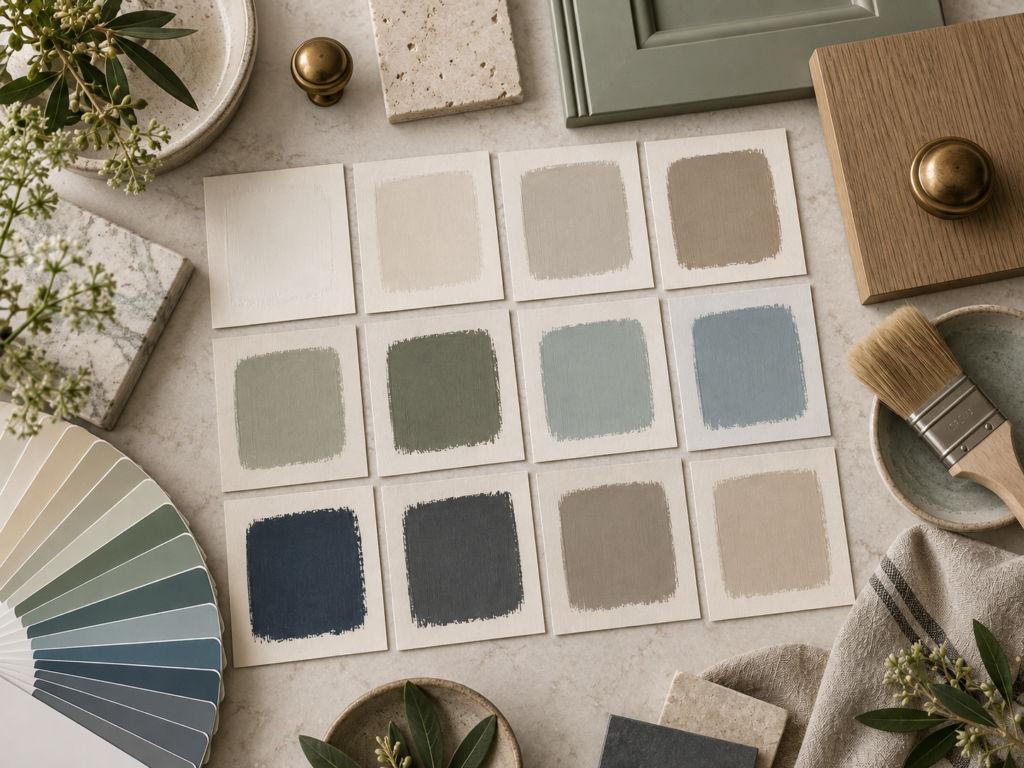
Trends are useful for inspiration, but they should never dictate your final decision.
What Kitchen Colours Are Popular in 2026?
Kitchen colours have certainly become more adventurous.
According to the 2026 UK Houzz Kitchen Trends Study, blue is currently the most popular cabinet colour amongst homeowners renovating their kitchens, chosen by 18%, closely followed by green at 17%. Grey, off-white and white follow behind. Almost three in ten homeowners choosing contrasting cabinetry are also using different colours between upper and lower cabinets. (Houzz)
But within those broad colour families, tastes are changing.
Warm neutrals
Warm neutrals are becoming increasingly popular as homeowners move away from colder greys and stark whites.
Think:
- warm stone
- putty
- mushroom
- taupe
- soft greige
- oatmeal
- warm ivory and cream
These colours are particularly successful on traditional cabinetry because they allow the shape and detailing of the doors to do the talking.
They also sit beautifully alongside natural oak, stone worktops, aged brass and other materials commonly found in bespoke kitchens.
Designers looking ahead through 2026 are highlighting warm taupes, mushroom shades and softer greiges as an increasingly important direction for kitchen cabinetry. (Livingetc)
For many of my clients, these are excellent choices because they feel contemporary without making the kitchen look excessively fashionable.
Cream Is Making a Comeback
For years, cream kitchens became associated with a particular period of kitchen design and consequently fell slightly out of favour.
That is changing.

The newer creams are softer and more sophisticated — less yellow than some of the magnolia and ivory tones associated with kitchens of the past.
Think more along the lines of clotted cream, warm chalk, linen or soft ivory.
Contemporary designers are once again using these warmer creams because they give the lightness of a white kitchen without appearing cold or clinical. (Livingetc)
For a hand-painted bespoke kitchen, particularly in a period property, cream can still be an extremely elegant choice.
It also works beautifully with wooden worktops, natural stone and traditional brass or bronze hardware.
Green Kitchens Aren’t Going Anywhere
Green has been enormously popular for several years, particularly sage.
And although sage remains a lovely colour, we are beginning to see greens becoming slightly deeper and more interesting.
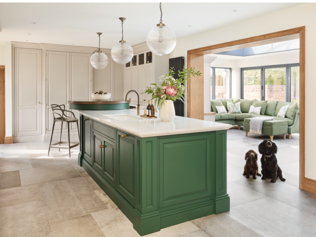
Olive greens, moss greens, earthy greens and green-browns are becoming increasingly popular, particularly when paired with timber, marble and aged brass.
Recent design coverage suggests that homeowners are gradually moving beyond the ubiquitous pale sage towards richer and more characterful greens. (Homes and Gardens)
Green works particularly well in kitchens because it feels connected to natural materials.
Oak, stone, marble, slate and timber floors all tend to sit very comfortably alongside it.
Blue Kitchens
Blue is wonderfully versatile.
At one end of the spectrum you have soft, chalky blue-greys that can make a kitchen feel light and relaxed.
At the other you have deep navy, ink and petrol blues that can give cabinetry real presence. This Inky blue kitchen was transfomed from dull orange oak doors, you can read more about the transformation here.
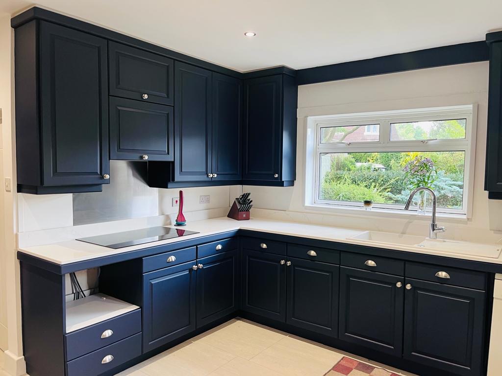
Blue is currently the most frequently chosen cabinet colour recorded in Houzz’s 2026 UK renovation research. (Houzz)
Deep blue cabinetry can look particularly striking with:
aged brass hardware
light stone worktops
natural oak
warm white walls
traditional timber flooring.
Softer blues are often easier to use throughout an entire kitchen, particularly where natural light is limited.
Burgundy, Red and Deeper Earthy Colours
One of the more interesting recent changes is the return of red-based colours.

I don’t necessarily mean bright pillar-box red.
We are talking about sophisticated shades such as:
burgundy
oxblood
deep terracotta
brick red
aubergine
wine.
These colours can look fantastic on a freestanding dresser, kitchen island or pantry cupboard.
Deep heritage-inspired reds are appearing increasingly in current kitchen design and work particularly well alongside dark timber, stone, aged metals and traditional properties. (Homes and Gardens)
They won’t be for everyone — but that is rather the point.
A bespoke kitchen does not have to look like everybody else’s.
Dark Charcoal and Off-Black
Another colour family worth considering is charcoal.
This is very different from the cool mid-greys that dominated interiors a few years ago.
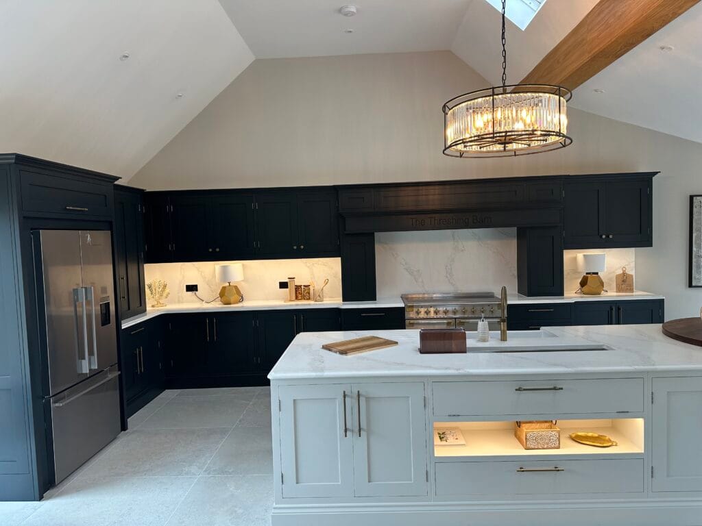
Modern charcoals often contain brown, green or blue undertones, giving them considerably more depth.
They can look particularly sophisticated on a large island, dresser or pantry cupboard rather than necessarily throughout an entire kitchen.
Designers are increasingly favouring deep graphite and off-black shades alongside natural timber and characterful stone. (Livingetc)
Don’t Choose a Kitchen Colour Without Considering the Light
This is probably one of the most important pieces of advice I can give.
Never choose your kitchen colour purely from a colour chart.
Paint can look completely different once it is applied to a large area.
Natural daylight changes throughout the day, and artificial lighting changes it again in the evening.
The orientation of your kitchen can have a surprisingly large effect.
North-facing kitchens
North-facing rooms generally receive cooler natural light.
Cool greys, blues and some blue-based whites can therefore appear considerably colder than expected.
Warmer colours often work particularly well:
creams
warm stones
earthy greens
soft taupes
warmer whites.
South-facing kitchens
South-facing rooms usually receive warmer and stronger natural light.
This gives you considerably more flexibility.
Deeper colours can work particularly well because plenty of natural light prevents them from becoming oppressive.
Greens, blues, deeper neutrals and stronger colours can all be very successful.
East-facing kitchens
East-facing rooms receive their strongest light in the morning.
A colour that looks beautiful over breakfast can appear completely different later in the afternoon.
This is why testing colours at different times of day is so important.
West-facing kitchens
West-facing rooms behave almost in reverse.
They may appear cooler earlier in the day but become much warmer as afternoon and evening sunlight enters the room.
Again, a movable painted sample is invaluable.
Look at What Is Already in the Kitchen
The cabinetry is only one part of the colour scheme.
Before choosing your paint, look carefully at everything that is staying.
Worktops
Are they:
warm or cool?
plain or heavily patterned?
wood, granite, quartz or marble?
A cool blue-grey cabinet might look wonderful against one worktop but completely wrong against another.
Flooring
Flooring covers a very large area and therefore has a considerable influence on the room.
Warm oak flooring, limestone, slate and modern porcelain tiles will all interact differently with paint colours.
Splashbacks
If your splashback is staying, take its colour into account.
If you are replacing it, ideally make that decision before finalising the kitchen paint colour.
Hardware
Handles and knobs can subtly alter how a colour feels. Check out Slingers1858 our recommended Suppliers.
A sage-green kitchen with polished chrome hardware feels quite different from exactly the same cabinetry with aged brass.
This is one of the reasons I like to consider the whole kitchen rather than simply the paint colour.
Should the Island Be a Different Colour?
Absolutely — if the room suits it.
A contrasting island can introduce colour without committing the whole kitchen to a stronger shade.
For example:
Warm cream cabinetry + olive-green island
Soft stone cabinetry + deep navy island
Warm neutral cabinetry + charcoal island
Pale green cabinetry + natural oak island
Contrasting cabinetry is already becoming commonplace; the 2026 Houzz UK study found that 29% of homeowners choosing cabinetry contrasts were using different finishes or colours between upper and lower cabinets. (Houzz)
The same principle can be applied successfully to islands, dressers and pantry cupboards.
It can make a hand-painted kitchen feel much more bespoke.
Think About the Age and Character of Your Property
Colour should feel comfortable within its surroundings.
A large Victorian or Georgian property may comfortably accommodate richer heritage colours.
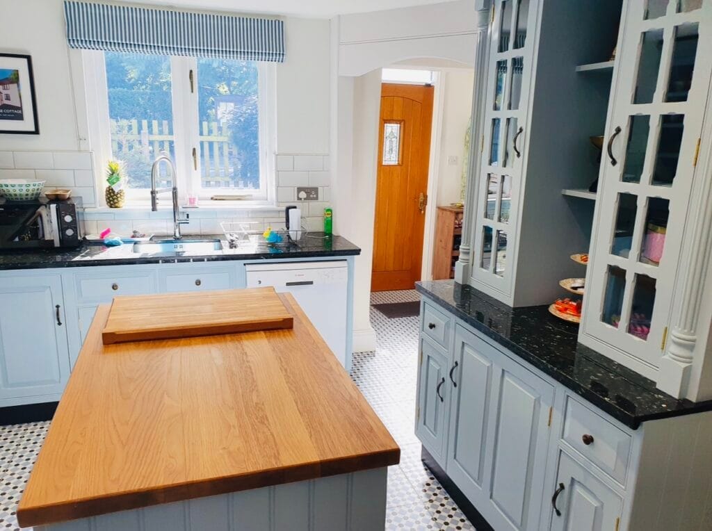
A country cottage might suit earthy greens, soft creams and natural colours. This country cottage kitchen in West Hallam, Derbyshire was painted in Parma Grey. See the full transformation here.
A contemporary extension with lots of glass may provide an opportunity to use something considerably stronger.
That doesn’t mean there are rules.
Sometimes an unexpected colour is exactly what brings a kitchen to life.
But the relationship between the cabinetry and the architecture is always worth considering.
Test Your Colours Properly
This is something I strongly recommend to my clients.
Once you have narrowed your choice down to perhaps two or three colours, have proper samples prepared.
Rather than painting several small squares next to each other on the kitchen wall, paint separate pieces of card or sample boards.
You can then move them around.
Put one:
next to the worktop
against the splashback
near the window
under the cabinets
beside the flooring
next to your handles.
Then look again:
in the morning
at midday
in the evening
with the kitchen lights switched on.
You may be surprised how differently the same colour behaves.
A shade that initially appeared perfect may suddenly look too green, too grey or too yellow.
Conversely, a colour you nearly dismissed may become the obvious choice.
Don’t Forget Artificial Lighting
People quite rightly think about natural light, but your kitchen probably spends a considerable part of the year illuminated artificially.
This is especially true during winter.
Warm lighting can bring out creams, reds and yellow undertones.
Cooler lighting can accentuate blues and greys.
Under-cabinet lighting can also make colours appear different from ceiling lighting.
So when assessing a sample, always look at it with the lighting you normally use in the evening.
Trends Come and Go — Good Colour Lasts
I enjoy seeing new colours emerge, and current trends can provide some fantastic inspiration.
In 2026 we are seeing a definite move towards warmer neutrals, creams, blues, richer greens, earthy tones and deeper character colours, rather than the stark whites and cooler greys that dominated previous years. Current design thinking also increasingly favours interiors that feel personal and layered rather than uniformly trend-led. (Livingetc)
But I would never suggest choosing a kitchen colour simply because it happens to be fashionable.
Your kitchen needs to work for you.
If you have loved blue for twenty years, you are unlikely to suddenly dislike it because somebody declares another colour fashionable.
Likewise, there is little point painting your kitchen burgundy because it appears in magazines if you have never particularly liked red.
A beautifully hand-painted kitchen should still feel right several years from now.
One of the Advantages of a Hand-Painted Kitchen
There is another benefit that is sometimes overlooked.
A genuinely hand-painted kitchen can be repainted again in the future.
Your cabinetry doesn’t suddenly become obsolete because fashions or your tastes change.
Providing the kitchen remains sound, it can be carefully prepared and given another colour when the time eventually comes.
That is one of the things I particularly like about working with good-quality existing kitchens.
The cabinetry may have been installed 15, 20 or even 25 years ago, but a thoughtful new colour can completely change its character.
Sometimes the transformation is remarkable.
Need Help Choosing Your Kitchen Colour?
If you’re considering having your existing kitchen professionally hand painted, choosing the colour is all part of the process.
I can help you consider the natural light, existing worktops, flooring, hardware and overall character of the room before narrowing down the colours that will work particularly well.
The specialist paint systems I use can be matched to a huge range of popular designer, heritage and contemporary colour palettes, as well as bespoke colours where required.
Based in Nottingham, Russ Pike Interiors specialises in professionally hand-painted kitchens and bespoke cabinetry throughout Nottinghamshire and the wider East Midlands.
Sometimes choosing the colour is the hardest part.
Fortunately, it’s also one of the most enjoyable.